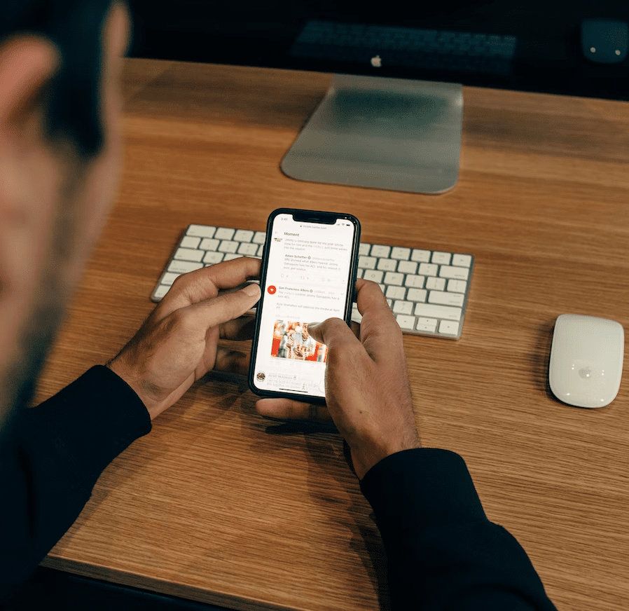
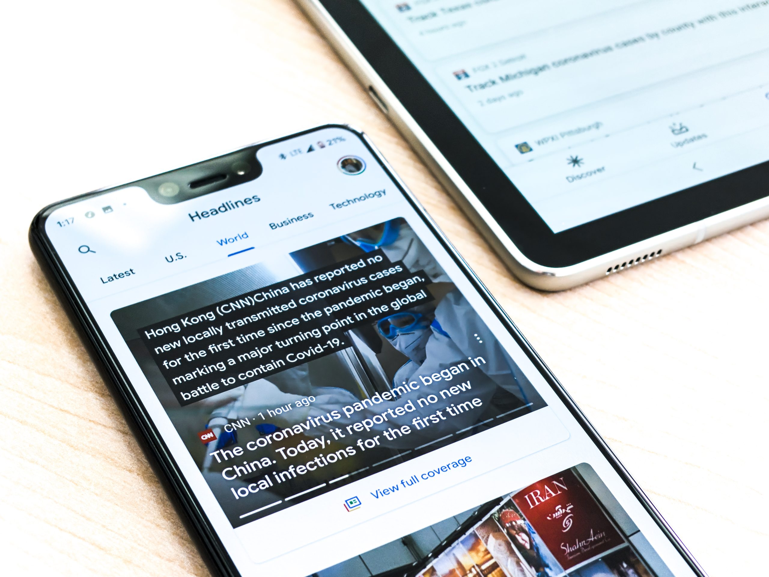
In today’s world, mobile devices have become an integral part of our lives. People use their smartphones and tablets to access information on the go, including news articles and updates. As a news site owner, it’s crucial to ensure that your website is optimized for mobile devices to provide a seamless user experience for your readers. One effective way to achieve this is by using the WordPress Newspaper theme, a powerful tool that enables you to create a visually appealing and mobile-friendly news site.
The shift towards mobile browsing has greatly impacted how news is consumed online. Today, a news website that isn’t optimized for mobile devices risks losing a significant portion of its audience. Fortunately, with WordPress Newspaper Theme, creating a responsive and mobile-friendly news site is easier than ever. In this blog, we’ll delve into the specific strategies and techniques you can use to create an outstanding mobile experience for your readers.
Set up Your news Site with WordPress Newspaper Theme
If you have procured a WordPress Newspaper Theme, then it is time to get your news-based site off the ground! To begin with, log into your dashboard and locate the Settings tab.
This page will offer various options for configuring the newspaper theme’s appearance. Some of these options may be overwhelming at first glance; however, let us take a moment to examine them one by one:
Selecting “Use Custom Post Type” will enable you to create instances within your content management system (CMS) that are specialized for presenting a specific type of article. This can be quite convenient when creating specialized pieces such as ‘blog topics’ or ‘quotes from press releases’; even creating ‘sections’ within an article can help keep things organized! The default arrangement for your News categories is ideal for those who are just starting out on their journey toward creating a news website. However, if you want something simpler – yet still effective – we encourage you to consider reorganizing the structure of your choices!

Tips to Make Your News Site Better
Creating a successful news site requires much more than just publishing articles. To stand out from the competition, it’s essential to continually improve the user experience and offer content that’s relevant and engaging. So, here are some tips that you can follow:
You should include video and audio content on your mobile site
Video and audio content are a potent combination that should be utilized on your news site. Video is an exciting new medium that can evoke strong emotions; it may even prompt viewers to click on other content! With the popularity of mobile devices soaring, it’s imperative to equip your media with an optimized layout for this device type. If you’re not yet utilizing video or audio on your site, now would be the time to start!
Use a responsive design for your mobile site
Unlike the desktop version of your news site, which is sized to fit all displays from large HDTVs to tablet screens and smartphones, the mobile version will be customized for each device. If you’re not already using a responsive design on your site, it’s time! Responsive web design (RWD) is a concept that strives for one singular layout that adapts to various devices, such as desktop browsers and illustrated smartphones. By incorporating a fluid grid system into your website’s design, users can access content seamlessly regardless of their screen size!
Make sure your news is optimized for mobile devices
If you’re utilizing a venerable news design, chances are it is not optimized for mobile devices. To ensure that your content is accessible from any screen size, all elements should be accessible, including headlines and subheadings. Ensure that your news posts are properly formatted so users can view them conveniently on their smartphones or tablets. Use the latest headlines, cards, and categories to maximize readability – don’t forget to utilize alt text data in images as well!
Optimize your images for mobile devices
If you have invested in a high-quality photography service, don’t waste this opportunity by pasting the highest-quality pictures on your site. However, if you are using a stock photo library or other third-party options such as Getty, Corbis, and iStockphoto – be mindful of their resolutions! When publishing images on your news site, always ensure they are sized properly. Don’t use low-resolution images; provide eye-catching visuals to entice potential readers.
Optimizing your images for mobile devices means ensuring that images on your website are visually appealing and properly displayed on different mobile devices, such as smartphones and tablets. This involves compressing the images to load quickly on mobile devices with slower internet connections, reducing their file size to save bandwidth, and resizing them to fit smaller screens without losing their quality.
Add an About page
In the absence of an About page, visitors may be perplexed as to who they are dealing with. With news websites especially, it is essential that visitors understand who they are accessing information from and why they should care. A brief About page can be an ideal location to concisely introduce your business or content material. Consider adding links to social media profiles, contact details, and more – this will help provide clarity on who you are and foster trust in your brand!
A better user experience, engaging content, and effective distribution strategies will help you attract and retain more readers and establish your site as a go-to source for news and information. Keep experimenting with new ideas and strategies, and don’t be afraid to try out new tools and technologies to make your news site the best it can be. With dedication and hard work, you can build a news site that meets the needs of your audience and helps you achieve your goals.

Conclusion
Optimizing your news site for mobile devices is essential for reaching a wider audience and keeping up with the changing digital landscape. With WordPress Newspaper Theme, you have a powerful tool at your fingertips to create a mobile-friendly news site that engages and informs your readers, no matter where they are. By following the tips and best practices we’ve covered in this blog series, you can create a responsive, user-friendly, and mobile-optimized news site that delivers a seamless experience to your readers. Whether you’re just starting out or looking to improve an existing news site, optimizing for mobile should be a top priority. With these strategies and tools, you’ll be well on your way to success in the mobile era.

